Flutter
Make the most of this cutting-edge technology by developing apps quickly! Our Flutter solutions have amazing features that can be used to create sleek, high-performance apps that can scale seamlessly across platforms.


We aim to build applications that excel in all aspects. We consider customer satisfaction as the best award we could receive. In that journey, we have been recognized multiple times for the exceptional products we deliver.
Faster work process

Customer Review on Google
Successful projects accross the world
We are a team of highly dedicated mobile app developers that build cutting-edge mobile applications with the latest technologies.
About us
We cater to dedicated and tailored app development to help companies expand and achieve new heights. We deliver great features focusing on the latest technological advancement.

Our expertise in hybrid application development in Kerala, comes by integrating our agile methodology. We are the leading experts in hybrid application development.

Our rank booster packages reap maximum results for ranking mobile apps higher in the highly competitive niche. We get ahead with a proper ASO strategy crafted under our years of ASO experience.

Our landing page creation in a faster mode connects seamlessly with popular marketing platforms. We build efficient landing pages that crush your revenue goals.
We are a team of highly dedicated mobile app developers that build cutting-edge mobile applications with the latest technologies.
View all Services
Make the most of this cutting-edge technology by developing apps quickly! Our Flutter solutions have amazing features that can be used to create sleek, high-performance apps that can scale seamlessly across platforms.
Explore the endless possibilities of mobile app development with our Figma services. Design compelling apps and refine your tech skills, all while leveraging cutting-edge tools to make a meaningful impact in the industry. Appzoc ensures a seamless user experience.

From startups to enterprises, we specialize in creating Android app development services that drive growth. Our team at Appzoc focuses on developing apps that provide an outstanding experience across all Android devices and wearables.

Node.js, for its high scalability, simplifies the mobile application process and is widely used for real-time applications with many open-source libraries and frameworks. The server-side and client-side switches are easy with Node.js. Node.js developers can constantly publish new code making the app possible as and when needed.
We are a team of highly dedicated mobile app developers that build cutting-edge mobile applications with the latest technologies.
View all Technologies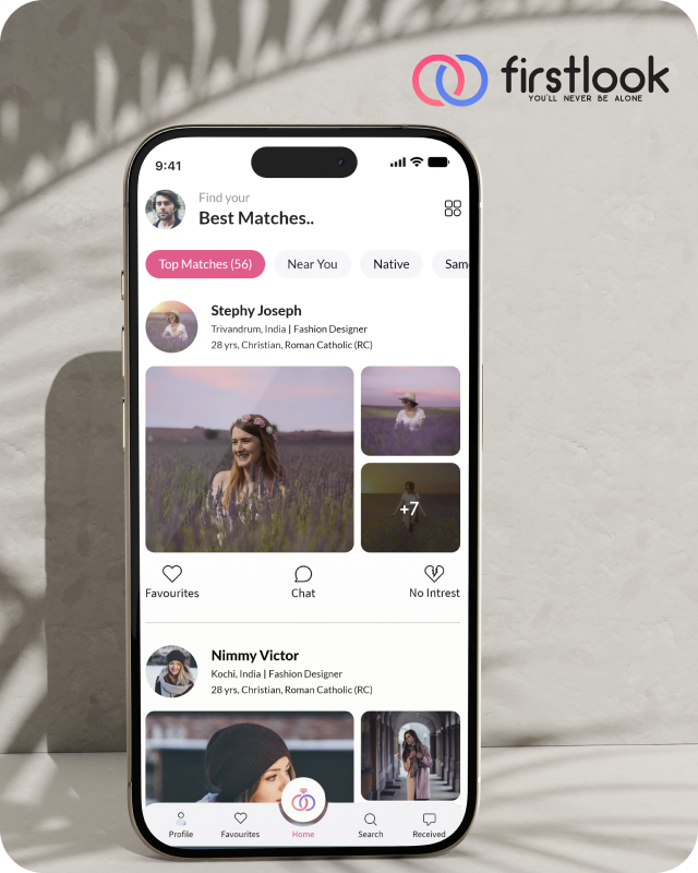
FirstLook Matrimony is a modern matchmaking app that helps you find your perfect life partner with personalized matches, easy chat options, and a secure platform built on trust.

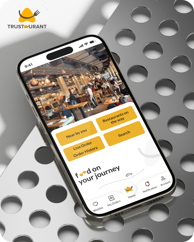
Trustaurant is a travel-friendly food app that helps you discover and order from trusted restaurants nearby or along your journey, all in real-time.
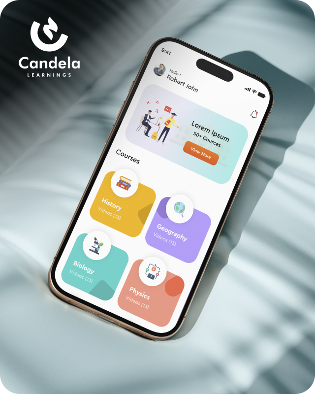
Candela Learnings is an engaging educational app offering interactive video courses in subjects like History, Geography, Biology, and Physics—all in one place.
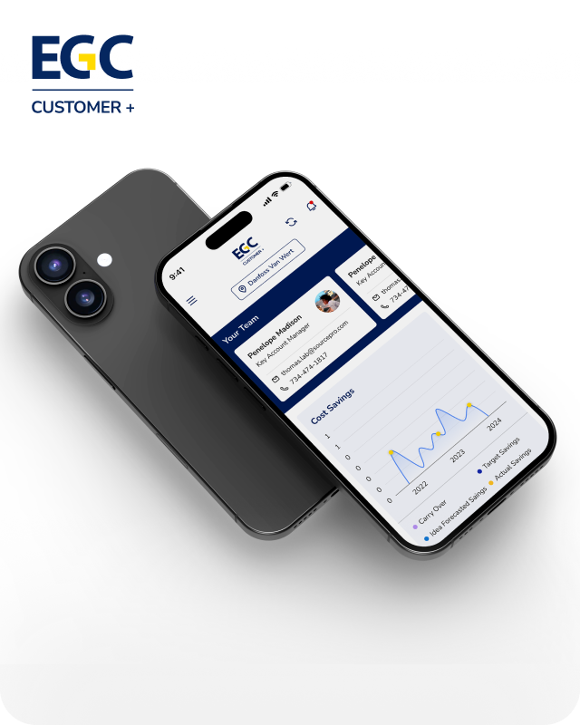
EGC Customer+ is a smart, user-friendly app designed to help you track cost savings, manage key contacts, and stay in control of your account performance—all in one place.
We are a team of highly dedicated mobile app developers that build cutting-edge mobile applications with the latest technologies.
View all WorksWe are a team of highly dedicated mobile app developers that build cutting-edge mobile applications with the latest technologies.
View more openings

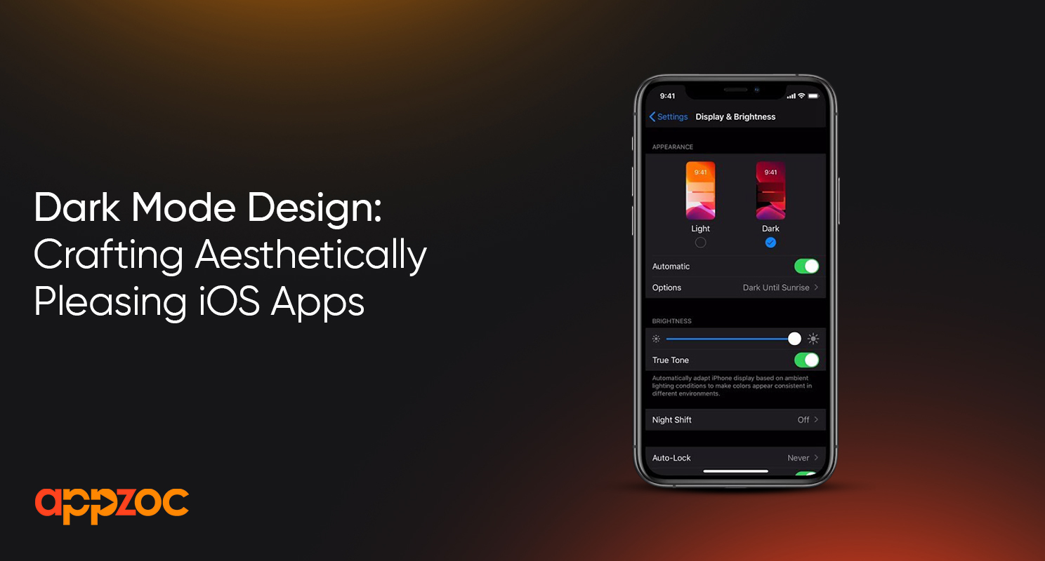
Dark mode interfaces have become immensely popular in recent years. The sleek, modern aesthetics coupled with practical benefits like less eye strain and battery drainage have made dark versions standard for many iOS applications.
However, merely inverting a light interface to dark colors rarely produces an aesthetically pleasing result. The most compelling and usable dark mode iOS apps follow dedicated design principles to craft truly striking nighttime user experiences.
In this post we’ll cover essential guidelines and tips for designing beautiful high-contrast interfaces specifically on iOS. Keep these top of mind and your custom mobile app will delight users each time they trigger dark mode!
The foundations of strong dark theme design come down to understanding contrast and adjusting accordingly. When shifting to a darker palette, designers must reassess foreground, background and accent colors holistically. Is text still clearly legible against darker backgrounds?
Do interactive buttons retain sufficient contrast to indicate tappability? Are any lighter scheme elements now distractingly bright? Assess such points of friction across the entire interface. Often minor tweaks to shade, saturation or opacity for both copy and background colors balances contrast evenly.
Consult Apple’s contrast guidelines to choose hues in correct ratios for reading text over backgrounds. Test interfaces in real dark environments accounting for glare since reflected light impacts perceived contrast and legibility significantly. Apple’s dark mode-first design language prizes effortless content scanning balanced with aesthetics.
Effective dark theme apps artfully incorporate depth in the interface via layered design elements. Overlapping cards, subtle shadows and slight distortions on overlapping objects together signal tangible dimensionality. This grants a refined, almost cinematic quality versus flat one-dimensional layouts.
Deeper blacks as background colors also enable objects like cards or buttons to visually separate themselves into the foreground more starkly. To prevent clutter, selectively apply such depth only for key content containers, maintaining cleaner negative space elsewhere. Depth attracts attention to core app destinations and content areas supporting intuitive workflows.
Custom icon design plays a huge role in bringing delightful personality and harmonic cohesion to dark interfaces. But icon adaptations shouldn’t stop at simply inverting a light version to darker shades. Introduce nuanced touches like switching white fills to subtly brighter tones for clearer recognition without stark contrast against dark backgrounds.
Where appropriate, lean into bolder metaphoric styles with iconography as well. Line weights may thicken slightly with more playful imperfections and hand-crafted qualities showing. Such adaptations feel fresh yet familiar, signaling day/night mode changes while retaining brand identity beautifully.
Also Read:How to Build Your First IOS App with Swift and Xcode
Spicing up standard system animations also brings more polish and focused attention to key micro interactions. As users tap buttons and navigate between views, creative transitional animations guide focus smoothly. This leads eyes logically through tasks while adding character compared to dry static screens.
For dark mode, experiment with bolder flowing animations that almost mimic liquid or spatial distortion effects as users engage elements. Touch points can ripple into view replacing flat taps. Drawers slide open with more flourish. Simple flourishes make otherwise mundane app flows feel magical. But keep response times tight – snappy microinteractions never impede usability. Between Apple’s fluid ecosystem and the expanded canvas darker schemes provide, opportunities abound to innovate interactions.
With darker interfaces increasing reliance on contrast rather than color cues, refining navigation and information hierarchy takes on greater importance so users can orient easily. Evaluate if core menus and buttons remain clearly scannable in darker modes to prevent any access friction.
Similarly, assess whether sufficient visual indicators effectively establish in-context surroundings so content areas feel distinct as users navigate deeper into workflows. Shadows, background shade differentiators and spacing again help articulate structured page areas, preventing interfaces from blending together into black voids! Placement shifts may help important navigation stick out more prominently if needed as well.
Designing truly stellar dark mode experiences demands rethinking multiple interface ingredients from color balances to microinteractions and content layouts. When done effectively following iOS interface conventions, the results feel immediately more modern, cinematic and usable especially late at night. Users perceive real polish realizing the care put into adapting themes appropriately.
We covered key design considerations like intelligently managing contrast ratios, layers for depth, icon adaptions, animated focus and reinforced information hierarchy. As you craft custom iOS applications, keep these principles in mind from early sketches and flows to fully implemented screens. Deliver that “wow” factor with dark mode-first designs across mobile and desktop interfaces.
Need additional guidance executing a stunning night or day iOS app design system? Please don’t hesitate to reach out. Our mobile product agency ios app development in bangalore would welcome collaborating to produce beautiful bespoke applications tailored to your brand and customer needs.